The Logo

Consistent use of the Nipissing University logo, which is made up of two elements - the symbol and the wordmark, will help to increase the visibility of Nipissing University, project a strong institutional image, and provide a more cohesive and coordinated identity. This logo is a bold, flexible image that lends itself to a variety of applications and is available in four options. The design of the logo ensures a positive and recognizable impact, even when reduced to a small size.
Colour Palette
Colour consistency is a vital part of an identification program. This logo will appear on a diverse range of materials – paper, wood, metal, plastic, glass, etc., and it will be difficult to control the colour variances from one product to another. Nipissing University, therefore, has set out these guidelines to aid in the proper execution of its identity.
|
Blue |
Green |
|
Pantone 295 Process Mix: RGB: Hexadecimal: Vinyl: |
Pantone 341 Process Mix: RGB: Hexadecimal: Vinyl: |
The colours indicated above are given in Pantone, Process colours, and are used when producing a paper product. When the application of colour is required n materials other than paper, match the colour to the Pantone colours.
When the logo appears on a white coated or uncoated background, and the opportunity is available for colour, apply Pantone 295 (blue) and Pantone 341 (green).
The RGB and Hexadecimal colours are provided for use on screen and for web respectively.
If only one colour is to be used, consider a one-colour with tint option as seen in the following sections of this manual. Discretion must be used when the logo is to be applied on a background other than white.
Please consult the Marketing & Communications department via communications@nipissingu.ca for assistance with colour options.
Signatures
The following supplied formats are the only acceptable signatures to be used in publications, advertisements and promotional items. The balance between logo and type has already been designed and should not be altered. Choose the logo that best suits your particular need and enlarge or reduce the complete logo to the desired size. Never enlarge or reduce only one element of the logo, but rather size the wordmark and symbol as a unit.
If printing is restricted to one colour in situations such as newspaper advertisement or inexpensive print runs, consider using the blue, black or reverse logo with tint options. In most instances when the logo appears on a white or light-coloured background, the logo should appear in blue or black with a 65% tint on the 'U' in the symbol. In instances where the logo is to appear on black or a dark-coloured background, always reverse or drop the logo out of the background colour so it appears white with a 20% black tint on the 'U' symbol.
Never print the logos in any other colour, screen or tint than what is outlined in this manual.
Stationary
Letterheads
The artwork for the letterhead is shown below on an 8.5" x 11" sheet. There are two different letterheads. Only correspondence originating from the President’s Office will be printed on the President’s Letterhead. All other letterheads are to follow the generic format.
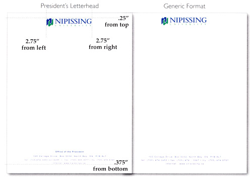
The typeface for the address is in 7pt Arial Regular, with 15pt leading. Be careful to follow the guidelines when printing. Simply follow the layout or use the artwork supplied on disc.
Business Cards and Labels
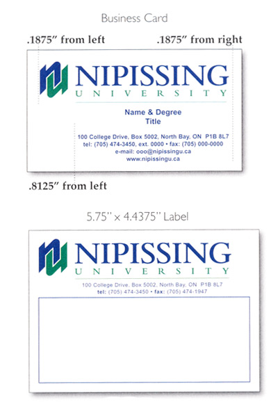
This artwork is for the reproduction of business cards, labels and envelopes. Simply follow the layout or use the artwork supplied on disc.
The information needed for the business cards is the name, degree(s), and title, extension, fax numbers, and email address.
All text for name, degree(s) and title is to be set in 9pt. Arial Bold. Contact information is in 7pt Arial Bold.
Business Card Stock
Byronic Cover
Weight 320m
Arctic White
Label Stock
Gloss Stock
Permanent Adhesive
on rolls of 500
Envelopes
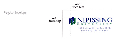
Two Colour Wordmark and Signature (for white envelopes)
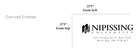
Black Wordmark and Signature (for brown or coloured envelopes)
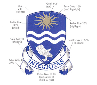
Coat of Arms
For authorized use of the coat of arms, please direct your request to the Marketing & Communications department via comm@nipissingu.ca or call (705) 474-3450, ext. 4494.
Typography
Fonts
Nipissing University uses the font "Futura STD" for the majority of text in printed pieces and online or digital applications.
Nipissing University uses the font "Garamond" for all body copy and paragraph text in printed pieces.
Due to the licensing of the Futura STD font and the requirement of Administrator access for font installation on University-issued devices, please contact Technology Services at ext. 4342 or submit a Help Desk ticket for assistance.
For suggested font sizes and colours with the university's watercolour imagery, please review the Nipissing University Watercolour Style Guide.
